
Developing the Colour System and Gradients
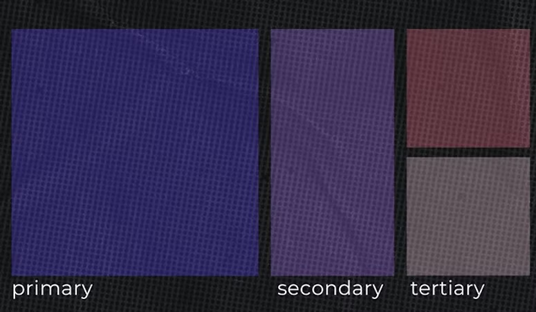
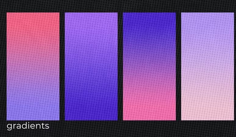
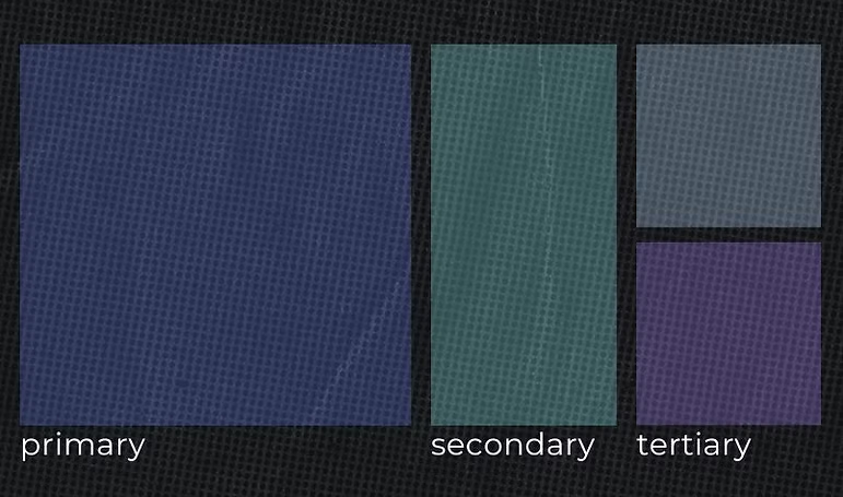
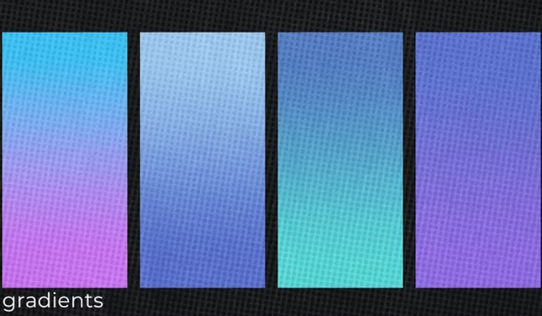
We explored two full colour system for Rewind HK built around the mood and atmosphere of their events. The palette combines deep tones with brighter accents to reflect the contrast between underground spaces and energetic electronic music. Alongside the core colours, we created gradient variations that bring movement and dimension to posters, social media assets and future event visuals. These gradients allow Rewind to build a recognisable digital presence while keeping enough flexibility to evolve the look for different lineups and locations.
Moodboard Direction 01
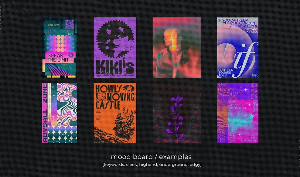
This direction explores a darker, more atmospheric palette that reflects the intimate and underground side of Rewind HK. The references focus on minimal lighting, deep shadows and clean typography, creating a mood that feels controlled, refined and immersive. It captures the quiet intensity of smaller electronic events and offers a visual base that works well for posters, motion and social visuals built around darker environments.
Moodboard Direction 02
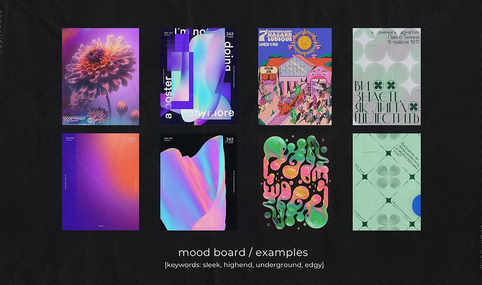
The second direction draws from a brighter palette with warm and energetic tones. It leans into movement, colour transitions and gradient play to reflect the more expressive side of Rewind HK’s events. The references highlight fluid lighting, soft blur effects and dynamic compositions that feel open and energetic. This approach gives the brand room to create more vibrant promotional assets, especially for outdoor events, sunset sessions and larger community gatherings.